If you took part in our first Future Forum or have read the blog ‘What’s next for Vevox after our first Future Forum’ then you’ll already know that we’re hugely driven by user feedback. Traditionally in the business world August can be a quiet month, with many people taking holidays. As our friends in Education will know, this time of year can be just as busy preparing for what’s coming next.
At Vevox, the development team have been hard at work to bring you the next release of Vevox. Our last release was feature packed, satisfying a lot of user requests. This release is all about overall improvements to the user interface and experience, making Vevox even easier to use and to help with increased adoption and engagement from session participants.
So what’s new?
In app badge notifications: This new addition is one that we have been asked for regularly. With this release, when new messages are posted in the discussion board, a red dot badge icon will display to alert participants that new posts are waiting to be read. This is really handy if participants navigate away from the discussion board as a visual prompt will guide them to re-join the conversation, therefore increasing engagement.
Single Log in page: Before this release, users had to bookmark their unique dashboard URL, or multiple URL’s if they have more than one Vevox account, in order to get access to their account(s). Feedback from you, our users, highlighted that having to keep track of the URL(s) was frustrating. So we took this on board and have created a single log in page.
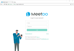 With this new release when users want to login to their account, after entering their email address and password, they will either go straight to their dashboard (if they only have 1 account) or to a list of all their accounts, if they belong to multiple accounts. Users with multiple accounts can then choose which account they want to enter. For those of you that have been requesting this functionality, we made it happen for you!
We hope that all Vevox users enjoy this simplified log in experience. Let us know your thoughts…
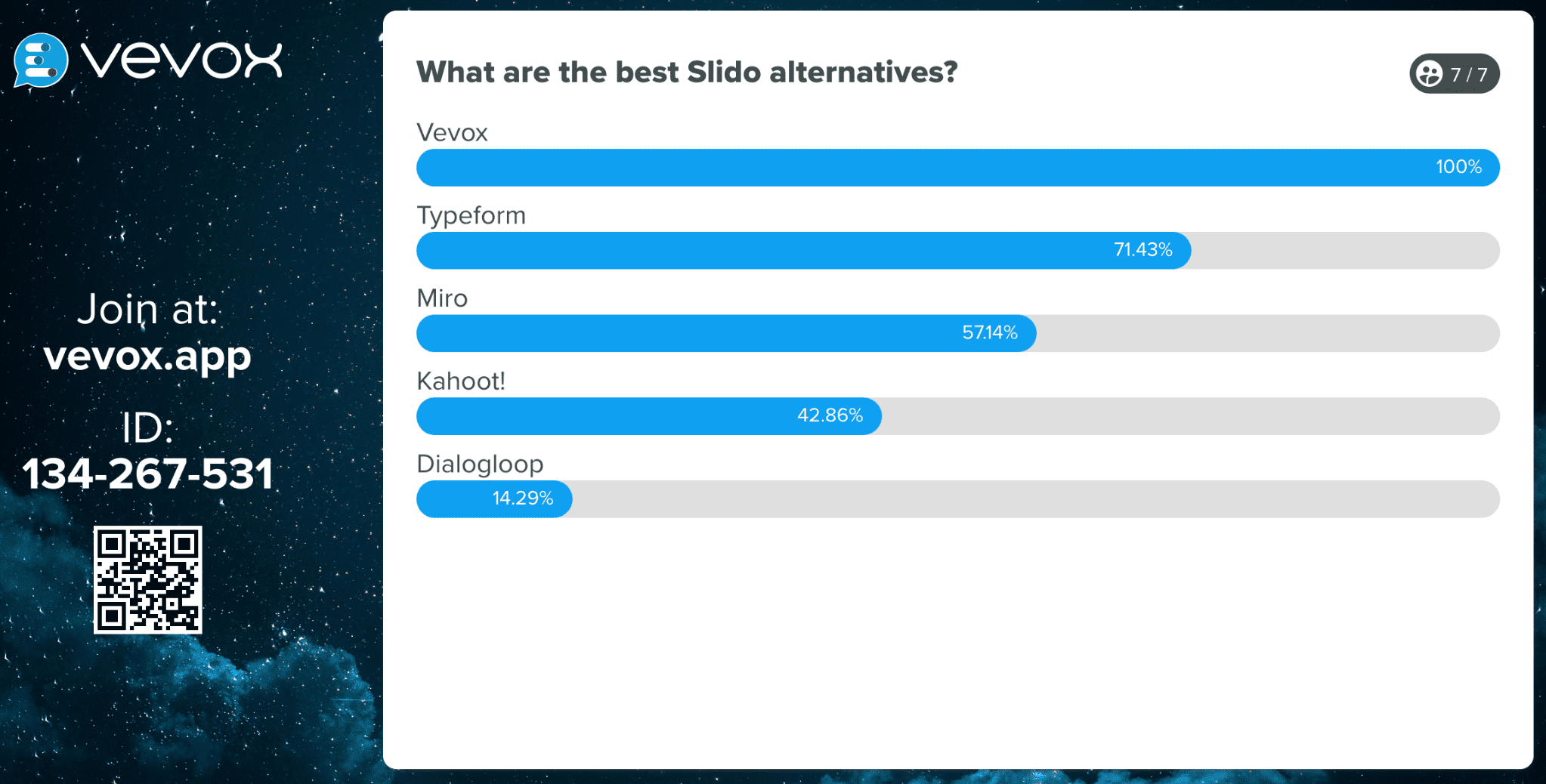
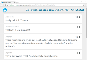
Join meeting prompt using projector view: If you’re using the projector view, we’ve added a prompt in the top right corner to remind your participants to actively take part by showing the web access address and the meeting ID that they’ll need. It’s a simple tweak but one that we hope will encourage session participation.
 Joining a meeting using the app (iOS users only): Our App is a huge part of the Vevox experience and we know that people use many different mobile devices to take part in meetings, classes and events. Being able to join a meeting quickly and easily is imperative to the user experience, so to keep things consistent we have made a minor UI tweak to the ‘Join Meeting’ screen in the iOS app to mirror the view that android users see. Now, app users using an iOS device will see an obvious input field (a box, in normal speak) to highlight where to enter the meeting ID for the session they want to join. This sounds pretty minor but from our testing we know that this has been a barrier in the past, so making this improvement will mean users can tap in their meeting ID and join a session in a flash.
These additions might not sound revolutionary but we hope that as they fulfil many user requests they will be met with your approval…and maybe even a virtual high-five or fist bump – you choose.
As well as the obvious changes outlined above there are some more subtle changes that have been implemented behind the scenes. Rather than elaborate on all the techy details we’ll just say that all these changes, visible or not, contribute to a better user experience, whether you are a session host or a participant.
If you’ve got a great idea for a feature, get in touch at hello@vevox.com and you could see it here in a future release blog post.

