Your sessions, your way – giving you more control.
If you’re a long standing ‘Vevox-er’, you’ll know that our user community is always a driving force behind Vevox’s development. If you’re new to Vevox then welcome, we love hearing your feedback, so send your thoughts to feedback@vevox.com
Vevox gets an update 3 times a year on average, and in this second update of the year (coming to your dashboard on Monday 21st June) our focus has again been on bringing you features and functionality that you’ve been asking for. Let’s get into the details...
LaTeX Support
Vevox users in Higher Education have been asking us for this and we’re excited to say that support for LaTeX is now here. For those who aren’t familiar, LaTeX is a descriptive markup language that is often used in mathematics, statistics, computer science, engineering, physics, economics, linguistics, quantitative psychology, philosophy, and political science.
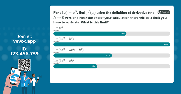
To help lecturers and those teaching or testing students in these subjects we have now introduced support for LaTeX in polling questions. The LaTeX language will appear in the polling questions both on screen and in the participant app. For more information about this functionality read our LaTeX help article.
More options for Q&A moderation and collaboration
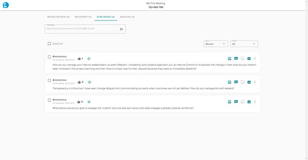
Vevox has simplicity at its core, but there are times when another pair of hands (or eyes) can make life a little easier and improve the experience for the presenter and participants. We’ve now created specific functionality to allow session creators the ability to share Q&A moderation permissions with another person, without them needing to be added to your account or have their own account.
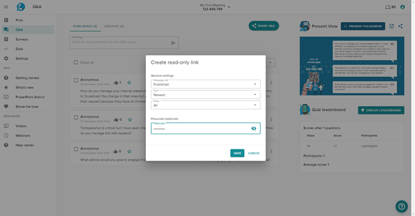
Whether you are running a webinar, lecture, or panel session, you can now give read only permissions to a guest moderator. Simply generate the link or QR code in your dashboard to send to your moderator. This link can be opened in a new web browser tab or accessed on a tablet, giving you ultimate flexibility for your scenario. For added peace of mind, you can also passcode protect this moderator access and guest moderators do not have any access to other parts of the dashboard. To learn how to use this feature read our help article.
Note: This feature replaces the legacy audience display feature which will now be retired.
Correct answer explanations
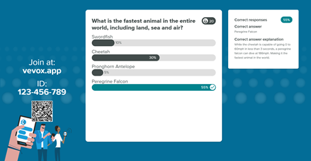
For those of you that like to run quizzes, we now give you the option to explain the correct answer and show this explanation on screen. We know that understanding the ‘why’ can help to reinforce learning, but it also has other benefits, including helping you to save time whilst running your quiz, or allowing someone with limited subject knowledge to run a quiz.
Manual response filter
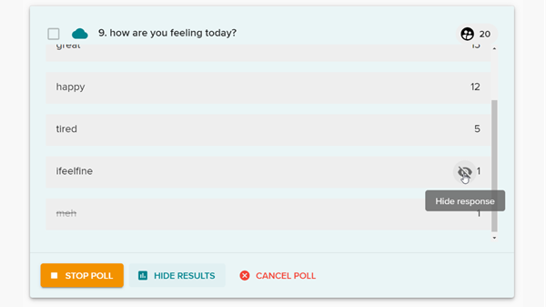
Everybody loves the thrill of a word cloud, but there may be times where you feel it’s not appropriate to display every response received back to the audience. Now you can spare any blushes or surprises by manually removing any individual words that you don’t want to appear in the final word cloud. This functionality also works for open text poll responses.
Display results as numbers
Displaying results as percentages is ‘the norm’, but it's not always the best or easiest way to represent the answer to a poll question. Now you can choose which option is best for your session and change it on a session-by-session basis if needed or choose to display both a number and percentage value.
-MC-poll_1.png?width=600&height=336)
Showing results as percentages remains the default option, but you can change this default if you are the account owner or administrator. Regardless of which option you choose or prefer, real number data has been and will continue to be available in your session report.
And there’s more...
As well as these main headline features, we also have some other more subtle additions to Vevox.
Optional show/hide response counter – When using present view, the default option is to show how many responses have been sent. There may be a situation where you don’t want this to be visible to the audience, so we have now given you the option to hide this. Want to do this for your next session? Here's how to show/hide the response counter.
Reporting improvements – Reporting is a valuable feature of Vevox. To help make the report more meaningful we have now adjusted the layout to make it easier to see which responses are new since the last time you ran a report.
Home screen formatting – Welcome your participants to your session with a richer and more professional looking home screen. As well as already being able to add a logo and branding, you can now choose from different font sizes and heading styles including bold, underline and italics options, as well as including hyperlinks, bulleted lists, and the all-important emoji’s.
Share your love of Vevox with others – Help your colleagues discover Vevox and show them what they’re missing! We’ve added the option for you to share your love of Vevox with others directly from your dashboard, and as a thank you for recommending us you’ll be eligible for a reward. Every day we see firsthand the power of a word-of-mouth referral and we wanted to make this process quicker and easier as well as give you a reward on top of the warm and fuzzy feeling of doing a good deed.
Remember, if you have any questions you can always chat to us via VoxBot on our website or in your dashboard, or drop us a line to hello@vevox.com
Happy Vevox-ing!

