Since our last update back in November 2017 the Vevox development team have been working hard to bring you this next update and the news of our Bett Award win and all the congratulatory messages definitely spurred them on!
A new question type
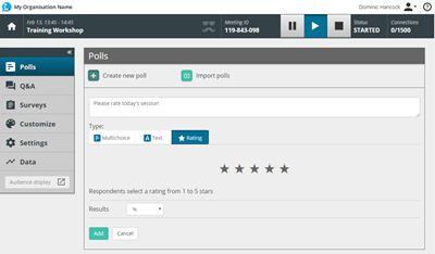
The star of this latest product release (we couldn’t help it!) is the addition of a star rating question type for use in polls or surveys. The star rating question type is a really quick and easy way to ask for feedback from your participants.
You could ask them about the session content, their level of understanding on your topic (before and after), or even the sound quality or their opinion on the catering choices!
A star rating is also a universally understood ranking scale so it needs no explanation, which makes it a great choice for use in welcome sessions or for ice-breaker questions, perfect for warming up the room. From a participant’s perspective, star rating polls or survey questions are really quick to answer, potentially leading to more honest, ‘in the moment’ responses. For Vevox session organisers, the results of a star rating poll or survey question are updated dynamically in the dashboard, showing the average response score, in addition to the individual responses.
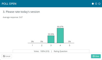
This new question type is available now and is available for polls or surveys, so give it a try!
If you are on one of our free education plans, you’ll need to upgrade to be able to access this feature.
Improved Dashboard Layout
For this release the development team have not only brought you a new question type but there’s been some changes in the dashboard too. We know that Vevox users want to get straight on with the task of populating their meetings with polls or surveys, so we have made the meeting creation process even simpler. Now, you’ll no longer need to set a date and time for your meeting before you can save it and move on. We know these options are important to some of you so don’t worry, we’ve not removed the time and date settings, you can now find these on the menu on the left hand side, look for the cog icon and the settings menu item.
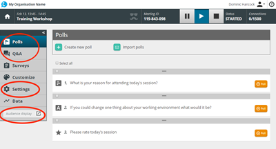
From user feedback we’ve gathered and analysis of data we know that polling is the most popular Vevox feature, so we’ve now made Polls the first menu item in the meeting dashboard. As well as this little tweak we’ve also updated the names of a couple of our features.
Messaging is now called ‘Q&A’ as we feel this is more self-explanatory and better suits the purpose of this feature. Rest assured, the feature still works in exactly the same way, it’s just had a name change.
Likewise, we’ve also renamed the ‘Projector’ to be called the ‘Audience Display’. Again this does exactly what it says on the tin. From talking to Vevox users we found that not everyone was as aware of this great feature as we had thought, so it was high time we gave it the spotlight it deserves. Do you use the Audience Display? It adds another dimension to your meetings or classes and is especially good for Q&A sessions or panel discussions, as your audience can see responses in real time, boosting the feeling of inclusion and encouraging participation.
Support resources and bug fixes
One of the most common things we here from users of Vevox is that it is so easy to use. This is music to our ears as we spend a lot of development time on keeping things straight forward. We never take for granted that some people might want a bit more guidance, so we have created the ‘Getting Started – interactive walkthrough’. This interactive guide walks new Vevox users through the process of setting up their first poll in the dashboard. Vevox is used most successfully when users also understand the positive impact from their participants’ perspective, so part of this walkthrough demonstrates how this works in real time on their own mobile device. Powerful stuff! We hope this will be a great help to all new users, especially those who have corporate or education institutional accounts with multiple new users joining all the time.
As ever we always do some housekeeping when we update Vevox so we check for bugs and fix anything that isn’t quite right. Some of you may be lucky enough to have the new iPhone X and in testing we found that our app didn’t look so hot with the new iPhone X screen dimensions, so we’ve tidied this up for you.
Did you catch our ‘What’s New, What’s Next’ webinar? if you missed it or simply want a recap then watch the recording on YouTube.
As ever, we love hearing from you, so let us know your thoughts on this update or anything else by sending an email to hello@vevox.com
